.webp)


.webp)


.webp)


.webp)


Welcome to ZUTTO
Free shipping for newsletter subscribers (some areas excluded)
- トップページ/
- ZUTTO Journal/
- 選び方・使い方/
- Vessels of freedo...

Free-form vessels, the standard of tomorrow - 1616/arita japan
A pure white plate might seem simple and easy to use, but that very simplicity can sometimes make a piece look clumsy if a single detail is off. This time, we're talking about a white plate—and a brand—that combines both usability and beauty.
It's said that porcelain was first made in Japan in 1616, in what is now Arita, Saga Prefecture. Arita developed into a major industrial center after the discovery of "toseki" (porcelain stone), the raw material for porcelain.
The name "Arita-yaki" is very well known, but it's not something people are especially familiar with for everyday use—if anything, it carries more of an "art object" image. 1616/arita japan was born as a new brand aiming to make Arita-yaki something people use every day, named as if to carry on the memory of that distant past, and it takes a design approach quite different from conventional Arita-yaki.
This time, we spoke with Mr. Hyakuta of Hyakuta Toen, who launched 1616/arita japan.

1616/arita japan TY Standard Series
Breaking away from "THE Arita-yaki"
We wanted to explore something new that would overturn the fixed notions of "Arita-yaki equals tradition" or "Arita-yaki equals Japanese food." So we asked designer Terahiro Yanagihara to visit Arita, observe the manufacturing scenery and processes, interact with the artisans, and give us his honest opinions.
Mr. Yanagihara had some harsh words: "What passes for Arita-yaki today is nothing more than a repetition of the techniques and designs of past generations." Of course, plenty of Arita-yaki pieces exist beyond the traditional hand-painted style, but even those, in Mr. Yanagihara's eyes, probably seemed like "just a slightly modernized design—not something that could become a global standard."
He felt that, at a time when even Japan's food culture has become so diverse, it would be a waste not to send a properly designed "standard" out into the world.

Even when stacking different sizes, the corners line up perfectly
We wanted to create plates that would be used not just in Japan, but all over the world. Rather than presenting Arita-yaki as traditional "THE Arita-yaki," we wanted to present it as a simple, new kind of plate that suits any dish or any table—one that just happens to be produced in Arita.
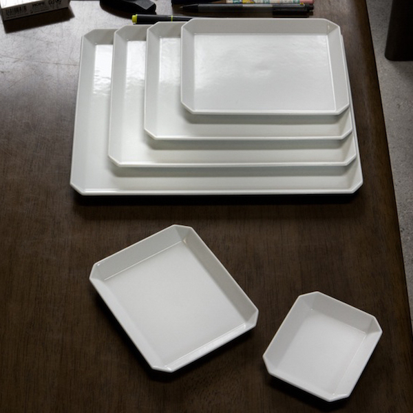
Focusing on the good parts
Arita-yaki tends to be strongly associated with vividly painted decoration, but with 1616/arita japan, that element was set aside entirely. Instead, the focus was placed on "the beauty of Arita-yaki's white porcelain."
Among white ceramics, there's actually a wide range of shades—some bluish, some dull-looking. But the white of Arita-yaki comes from the "toseki" stone unique to this land. It fires to a high strength while producing a beautiful white free of cloudiness. It also has the characteristic of being able to form porcelain without blending in other clays or materials—something said to be extremely rare, even by world standards.
1616/arita japan can be described as a form of making that puts this material uniqueness and technical strength front and center, refocusing on the inherent goodness that Arita-yaki has always had.
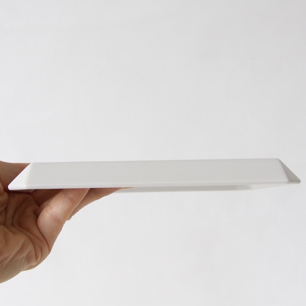
A satisfyingly flat plate bottom
The thinking behind the flat shape
On Mr. Yanagihara's advice, when we thought about designing for use around the world, we concluded that a foot rim wasn't needed. Most Japanese tableware has a foot rim, and the plates tend to be mortar-shaped. That kind of shape can't accommodate all sorts of dishes, so the instruction was to make it completely flat, with no foot rim at all. In other words, to make a plate you could eat pancakes on with a fork and knife.
Eliminating the foot rim means that, during firing, the entire bottom surface is in contact with the kiln floor. Pottery is fired in stages, and each firing causes the piece to shrink by 10 to 20 percent. If that shrinkage isn't even, part of the bottom surface lifts up and the piece wobbles. With this Standard series, the pieces sit completely flat, almost as if suctioned to the surface, with no wobbling at all.
No glaze has been applied, in order to bring out the beauty of the porcelain itself. Normally, glaze is applied before firing, but here the piece is polished in its unglazed, bisque-fired state to bring out its shine. Because porcelain does not absorb moisture, this approach draws out that particular quality to the fullest.

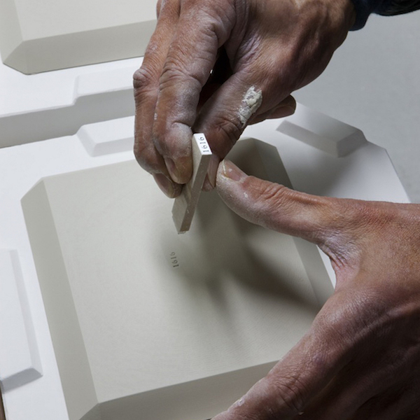
Like a craftsman's mark of pride, the brand's stamp is pressed into each piece
To Remain a Standard
What changed was our way of thinking. We had believed that a foot ring and glaze were essential elements of pottery, but we set them aside in order to create something better, something different from what came before, and this let us explore and search out new methods. It felt as though we were enjoying our own transformation.
We don't intend to keep adding new colors or new series one after another. Since we designed this brand from the very start with the intention of it becoming a 'standard,' we plan to devote ourselves to spreading that idea.
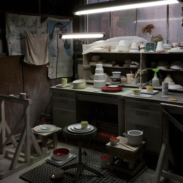
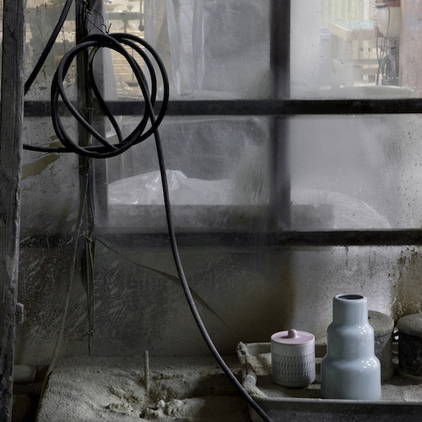
Design Is 30%—What About the Other 70%?
When Mr. Yanagihara was designing the TY series, this is what he had to say.
"A product shouldn't become a designer's self-satisfaction. If you lock the design down too rigidly, it becomes something people can't use in everyday life. To put it in extreme terms, design is only 30%. You have to leave the remaining 70% as blank space, so that the person using it can design the rest."
I thought this was a wonderful thing to say. It shows a designer's confidence that they are creating products meant for the people who use them—not an artist making art for its own sake—and a generosity of design that gives freedom to the user. That, in turn, is surely what leads to ease of use.


We choose different "plates" to suit different dishes. Japanese food, Western food, main courses, side dishes, soups—we pick whatever is best for the dish at hand, but when it comes to color, I don't think anything can beat a plain white plate. In fact, it's said that white tablecloths and tableware have the effect of making the colors of food look their best.
This TY Standard series in particular has a plate surface that is completely flat, almost like a canvas. The rim, which folds in a way you don't often see, is novel yet never gets in the way of the food itself. Japanese food, Western food, Chinese food, bread, soups, fruit, cake, and sometimes even things that aren't food at all. As if enjoying the blank space the designer left behind, you can freely imagine and discover new uses for it.
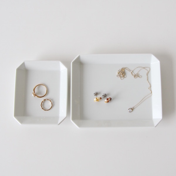
That very simplicity means the uses are never limited
What Does "Attachment" to a Plate Mean?
"Before you know it, you're always reaching for this plate"—that might be exactly what the TY series is. It's that easy to use, that easy to pair with other tableware, and that free.
Mr. Hyakuta also said, "Attachment is something that grows out of daily use. To make that happen, we have to create things that people want to use every day."
He also had these powerful words to share: "Since these are things that eventually break, it's important for us as a maker to keep making them, in order to answer our customers' attachment to them. We have to make sure people can keep buying the same pieces and keep using them, for as long as they like."
In order to answer that same spirit, we at ZUTTO hope to keep introducing these pieces for a long time to come.
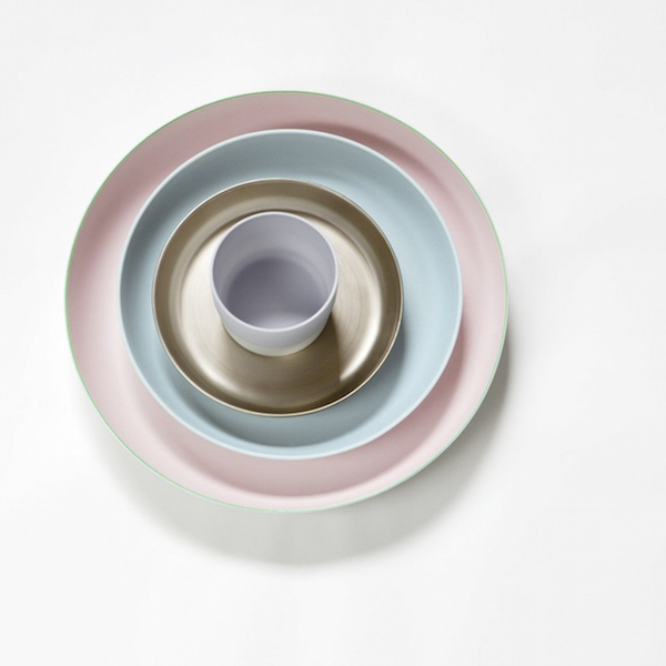
The "Color Porcelain" series, by the Dutch design unit Scholten & Baijings
▽The 1616/arita japan brand page can be found here

GUIDE »
CONTENTS »
CATEGORIES »
- + Gifts by recipient
- + Gifts by scene
- + Clothing
- + Bags / Backpacks
- + Wallets / Card cases
- + Jewelry
- + Shoes
- + Rainy day outfits
- + Kitchen
- + Home
- + Babies / Kids
- + Japanese products
Earn Miles


Payment & Security